.jpg?1699042256)
As we near completion and launch of our upcoming Spatial.io game, my partner/love @AdjectiveBeaver and I face decisions about how much detail is not too much and not too little, but juuuuust right for each of our 3D assets. By 3D assets I'm referring to models, textures, graphics, effects, audio, and interactive components for the game.
As I blog about my experience as a 3D artist and designer on the project, I'm also faced with fewer and fewer snippets that I can share to the world without revealing key components of the game that we hope our players will discover and delight in, unspoiled. For that reason, this may be the last post I write before we launch what we've tentatively titled "Stoven Universe."
While preparing to write, I bemoaned to my partner that I don't know what to share because many of the finishing touches are super small and simple. Not worthy of a whole blog post individually. But he encouraged me to consider that what is simple to me, decades into my career, may be inspiring or educational to folks just starting out. With that in mind, for my last pre-launch post, I want to share a bit about my approach to making these depth-of-detail decisions.
One of the principles that guide me is to think more and more of the project as a whole, the farther along it progresses. Whereas -- while we're creating specific components of the game, it is fine and even important to focus on minutia like developing a complex workflow for tackling a unique problem, or making sure this vertex snaps to that one -- at this point my mind is on ensuring that the whole experience is cohesive and polished, and that we don't delay or get bogged down by implementing every great new idea that comes to mind.
MY GOODNESS is that difficult. My experience with scope creep though, is that it is a demoralizing motivation killer, which gives me the courage to choose which details to budget my attention for with confidence. Published is better than perfect, to put a new spin on an old adage.
So here I'd like to present a small example, where I chose simplicity and completion over depth of detail. One of the key interactive pieces of our upcoming game is objects we are calling "scorables." Without revealing the purpose of these objects, I can say that button pins, the kind with a metal safety-pin clasp that you attach to clothing, are one of my favorite of the scorables I modeled and textured because of how clever they are for marketing. Yes! That QR code to my Link.tree is scannable, and it will be in game too.
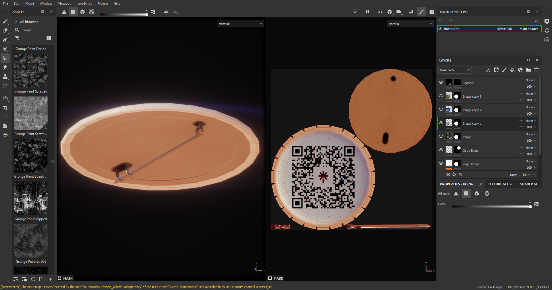
When I showed my colleague @MakerComet how I could (with her permission) add her logo to a pin in game, she was surprised at how fast I was able to put it all together. Therin lies the beauty, in my opinion. Above, you can see that I've set up my layers (in Substance Painter) so that I can swap in a variety of graphics for the button front. 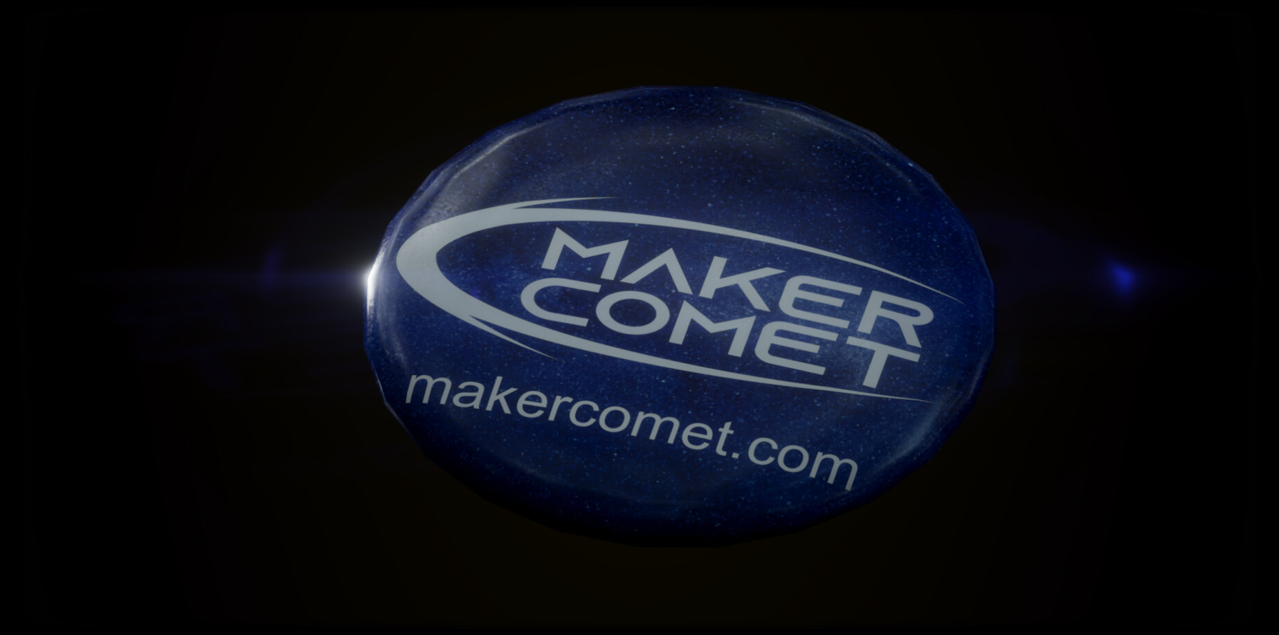 I've already exported the Metallic/Smoothness and Normal maps for our Unity URP shader, and when I add a new image, I simply rename the Material in Painter and export a new Albedo to Unity. This is an example of how I focused on the detail part in the early stages, so that now I can quickly create variations in the polish stage of our project. Since players will be up close and personal with the scorables, I feel the initial time spent was justified. (P.S. if you'd like me to create clever 3D marketing materials like this for you, you can reach me via LinkedIn here https://www.linkedin.com/in/laurieannis/ )
To give a contrasting example, as we fleshed out the 3D space (the nature of which I won't reveal until launch), we realized that some of the walls were a bit too bare. So as a finishing touch, I quickly modeled and textured this 3D wall calendar. This model is extremely simple. It's only five planes. The top half is an image we picked from my partner's photos to match the humorous theme, featuring the real life version of his wooden manequin avatar Skip, feeding one of his friends and favorite creatures (the Curve-billed Thrasher) a peanut. 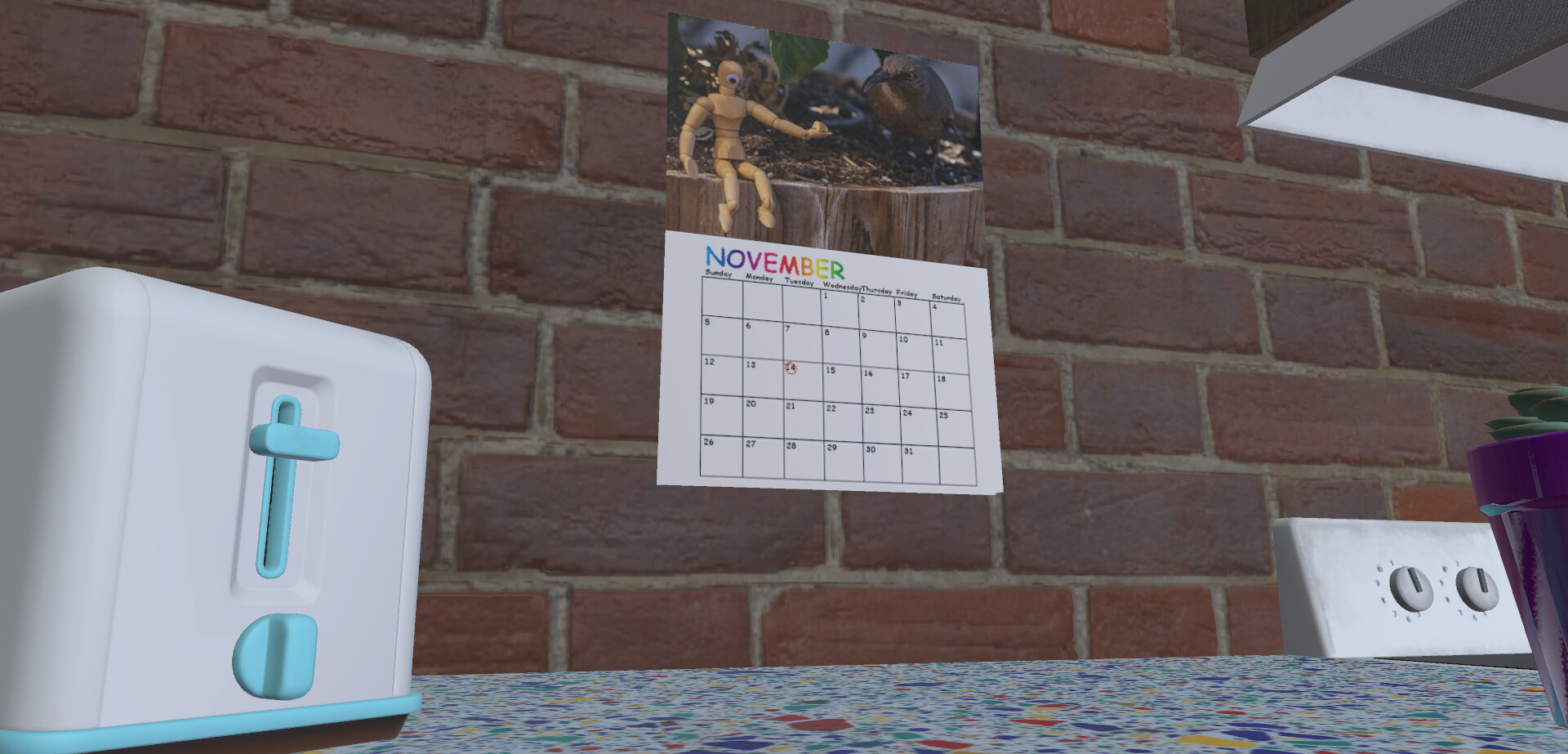
I used Adobe Illustrator to quickly design a "dollar store" graphic for the calendar part -- only bothering to make one month since the rest are almost completely obscured -- then I mapped the graphic and photo together on a single 2048x2048 texture, aligned the plane UVs with the image, triangulated the planes and bent them each a little for depth, and voilà! The Material doesn't even need extra maps, because I can get away with an average Smoothness, and it's really not a big feature of the scene. Just a finishing touch.
So that's it for this Work in Progress blog, until I'm sharing promotional material for the new space when it goes live! Thank you so much for following along on my journey, and please stay tuned for our next adventure.